I think it’s a new feature in Guitar Pro 8 as I tested it in Guitar Pro 7 and it did not work.
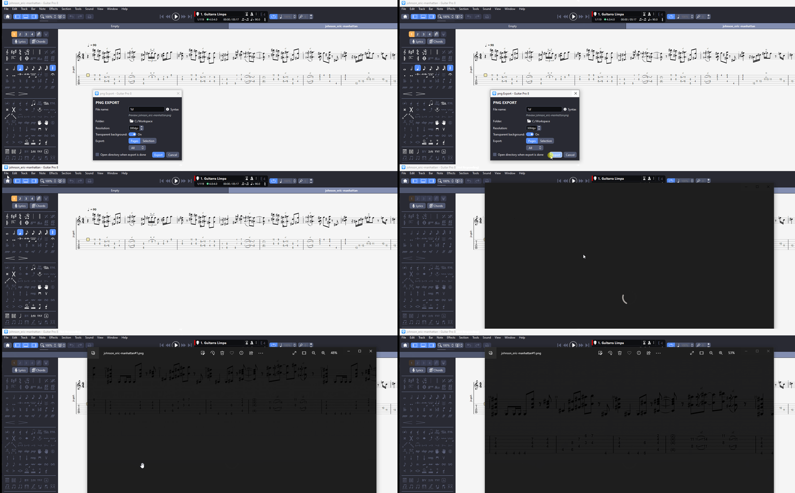
Gotcha. I think we have 8 in the office and I still have 7 at home. Since most people wouldn’t really know what to do with an image thousands of pixels wide, I wonder if this feature was enabled expressly for doing the scrolling tab trick. What else would you use it for?
Ha, exporting a long image is brilliant and the scrolling looks awesome. Thanks!
PS: we should tell @LeviClay88 about this as it could makes his transcription videos even more awesome
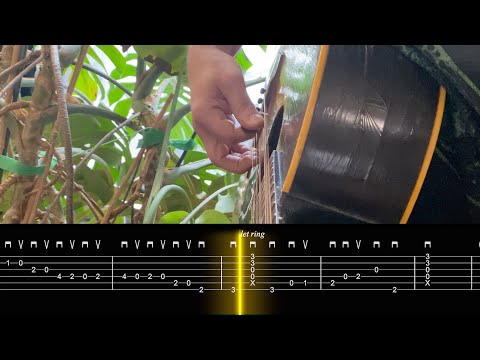
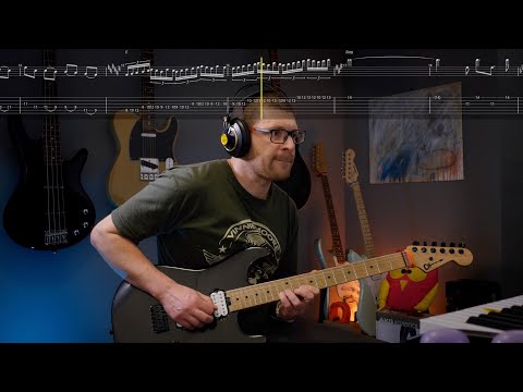
FYI just used this on a real YouTube / Instagram post:
The one bit I didn’t account for is the empty space between the bars, so the scroll can’t just be an even velocity — you do need a “syncpoint” at every bar to keep the playhead lined up to where the notes begin.
But the process is pretty easy. Just play until you see the pickstroke the begins the bar, click to add keyframe, then drag the X value until the tab lines up exactly. Rinse / repeat. Here’s what the result looks like in FCP for this clip:
For clips like the free time EJ intro, the process is exactly the same. Presence or lack of click doesn’t really matter since the scroll speed isn’t constant anyway.
Just from a casual viewing, this looks really pro (which we’ve unfortunately come to expect since you’ve set such a high bar for yourself  )
)
It’s super easy to grab a guitar and try playing your example with this. Which is nice, since a lot of your videos only show the picking hand, it takes a deal of reverse engineering to try figuring out what was in the clip. I think a lot of people will really enjoy this if you make it a regular feature in your short clips.
Honestly I just put this on YouTube because I had it. We made it as a test and we almost never put things on YouTube any more, being swamped with Magnets and other things, so I was like, whatever I’ll post that. I don’t have any sense if really short clips like this actually do anything for us.
What we know is that people find us by watching longer stuff with decent production that really taught them something. And we know this only because they mention it. For the super low-effort short stuff, I’m not sure how or even if that really works. Maybe if you make a constant stream of really short stuff, and that becomes your whole thing, that can do something. That’s what TikTok is I suppose. But that’s a job in itself — that we also don’t have any time for.
Well, it’s been a while. I did some more experimentation with this in the months since.
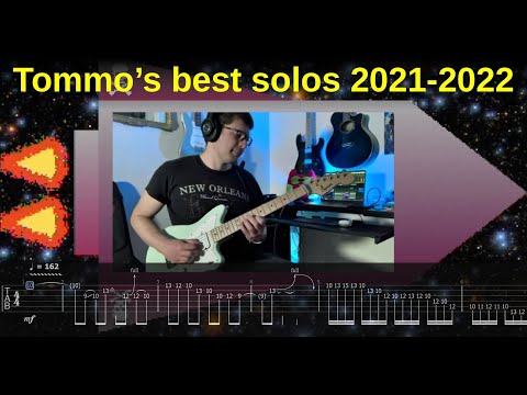
First, I made a “solo compilation” video with the “old” method of screen-capturing the Guitar Pro tab as it was scrolling:
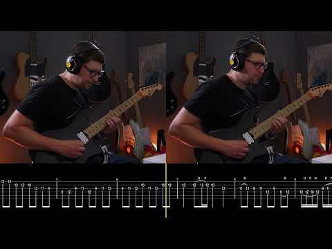
Then, I had a go at the method by Troy and @CyborgCutie which is probably the best / most flexible for my original objective, because you have this long png image and you can adjust its scrolling speed, zoom level, etc. by using a video editing software like Final Cut Pro.
In this first application, I exported bars of different widths in the png, so I had to sync each individual bar manually:
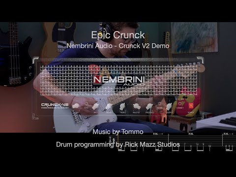
Then, I tried to find a method to reliably export a png image with bars of equal lengths from guitar pro 8. Not sure if it’s a bug or I missed something, but while GP8 has the option to have bars of the same size, the png export always reverted to unequal bars when exporting. So I came up with a hack: have a second tab filled with 16th-note pauses, which would enforce the bar size for the upper tab:
Then, I can get away with fewer syncpoints (ideally just one at the start, one at the end), and I can crop the bottom tab in the video editor so you don’t see it:
Now, for the last one, the same trick did not work, since I had some key changes that once again made certain bars have a different size (even with the “16th-pauses” trick). So, unless GP8 fixes the (suspected) png export bug (where you can’t enforce equal bar lengths in the exported image), we are back to having to manually set various sync points to make sure the scrolling is roughly correct around the key changes:
TLDR: I think @JakeEstner was right that at the end of the day all this may not be worth it in a world where SoundSlice exists 
However, I came to the conclusion that @JakeEstner was right all along — this is cool and all but it might not be worth the effort, versus just creating a “slice” on soundslice (where people also have the option of turning tabs on and off as needed).
It’s very rare that I’m wrong about anything.
JK but yeah this looks good and I understand the flexibility and control you want, but I feel like soundslice screen grab in the new dark mode, putting the vid together like that will take 1/100th of the amount of time and look about 96% as good imo.
But I’m just not a very fancy man.
Also, adding, I feel like the only thing you couldn’t get in soundslice is the see through component and control of color of your yellow bar. Besides that, seems completely doable to make a screen grab vid that looks identical to this.


