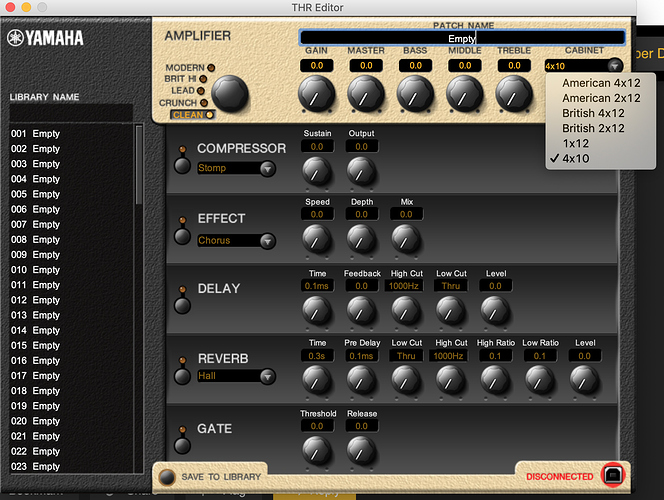
Gotcha. The UI looks pretty straightforward. I imagine this is just something you’d use to set up your sounds, save them into your preset buttons, and then forget about if you want.
As a technical person, I get that there’s always a sliding scale with these things. You want to provide a few extra features for those who want it, and a simple panel UI for those who don’t. It’s hard to serve two masters and get that balance right.
We have a small BOSS Katana amp that has this built in wireless dongle. The dongle goes to sleep when you’re not playing and the amp itself recharges the dongle when it runs out. The convenience of that, and no cable following you around the house, is a total win.
The actual sound is not. The amp tries to replicate a handful of stock amp models with BOSS pedals in front of them. None of the amp models appear to do any kind of decent high gain sound without one of the pedal models. And trying to select and audition these pedal / amp combinations is a nightmare. The number of menu levels deep you have to go, and the way each level of menus affects the gain staging of the one above it — it’s a usability disaster. I’m still not sure if the amp actually does a decent high gain sound without a wall of noise, battled by obtrusive gates, and I’ve given up trying. It’s just a clean amp for the living room.
End usability rant!


